scrappystickyinkymess


Leave a comment

Another horizontal calendar for 2016

I am just struggling to find time to blog, with everything else going on, but I did have this calendar I haven’t shared yet, so I thought I would add it.  I love that overprinted look, and that was what I was trying to accomplish here.

overprint

I did the 12 months then added a trio of filler cards at the end.  I usually try to limit the font use to just a couple, for most sets, but while I loved the font for the numbers I didn’t like it for the additional text on the filler cards.  I hope the over-printed big words tie them together well enough.

You can get the 3 x 4 card size here.  I also did the half-size version, which would make a cute tear-off set.  The smaller filler cards would certainly work on a standard scrapbook layout so you wouldn’t need to waste them.  Get the half-size set here.

The first of our fall visitors arrive next week so I may still be less seen for a bit longer.


2 Comments

Project Life Printables – famous Tees

So DS has been home for a bit, off casting LOL games for a night or two, back home for a few, off again.  And still tracking down little issues with the UKS move. Getting there but not totally there yet. So I have been pretty absorbed. Not a lot of bloggin goin’ on.

I have chatted with my sister occasionally about the tee-shirt quilt I made for DS when he went off to Uni.  I loved it as a great way to preserve all those shirts that I will always associate with him.

teeshirtquilt

I don’t seem to have a photo of the finished quilt, but you get the idea.  Anyway, it got me thinking about iconic tees.  And I thought about how to bring them to printables.  So I’ve had a bit of a play over the last week or so, in the odd quiet moment.

There are a lot of them that would make great printables, but then there is copyright to consider.  I think I am on the right side of the law with these.  I’ve modelled them visually on ones you will probably recognize, but altered the words to reflect a different sentiment. Musing about copyright gave me the last one, boyish and girly version. I am particularly fond of Mommy say RELAX. To be honest, I actually think they would make adorable onsies.

tees

In some ways they are a bit stark, but I’ve added a jolt of colour to each one.  They are purely experimental.  I am always curious to find out what strikes a chord, so even when I think something is interesting but not destined to be wildly popular (judged by download numbers much more than comments) I’ll always add them.  If even one person uses them in their PL album, then I’m happy.

Grab the single sheet here.


Leave a comment

More Project Life style Pocket Cards

A bit back I was playing around with some Pocket Cards for Project Life.

6foldoverpocket

You might remember those were designed to be printed on the front and the back, so when folded you got the two-colour effect as above.

But I was thinking it might be more useful to leave them blank.  That way, you are free to add whatever you want to them, to fit your own album and page.

I’ve just covered the back with patterned paper to coordinate.  It only takes a scrap really, so you could easily use bits of papers you have used elsewhere on the page, if they work colourwise.


foldoverpapers


And obviously you can use cardstock for a different look.

foldovercard

I don’t have a photo to show, but also easy to print on the back with any digital papers, or print the card on the back of commercial one-sided patterned cardstock too.  While I did like the idea of printed on both sides, because it takes the guess-work out of them, and some people like that, I do think this is a lot more flexible.  There are two pages but I’ll add them individually as well so you can print one or both as you prefer. This is what the other set looks like:pockets2This is both sets in one PDF.

This is the Love Notes set

This is the PHOTO Love set

These are for the JULY Project Life Challenge on UKS but I don’t have a place on the server (at the moment) to easily upload images for display. So I am adding them here so I can link to them there, and jumping the gun by a few days, as I am likely to forget, with all I have going on!   Hopefully by next month we’ll have it all sorted out.


1 Comment

The 2016 Pretty CD circle calendar – Monday to Sunday version

The Sunday to Saturday version was yesterday, and today …prettyCD2016_Mon_to_Sun

This is the link to the Monday to Sunday version.  Sorry this is coming so late in the day, I had it done yesterday but have been busy with UKS stuff and another thing I have to get sorted.  Life is just too crazy busy right now.

I just needed to find 10 minutes to sort out the half-size version just like the other one, so whether you do Sunday to Saturday or Monday to Sunday, you have a half-sized version to download.

prettyCD2016_Mon_to_Sun_halfsize


I’ll repeat myself: Don’t be fooled by the image size!! The first set is sized to fit a CD case,  4 3/4 inch across and 5 inch tall. The four-a-page prints at about 3 5/16th inch across and 3 1/2 inch tall.

and I’ll add a different project link to inspire you:

I think the grid paper photo cube could work for the half-size set:

10gridcube

Gosh that is a bad photo! Better?


bettercube


7 Comments

Pretty CD Circle calendar updated for 2016

OK, I’ve checked and checked and an as sure as I can be all is as it should be! I did NOT use a Dreamstime calendar for the dates LOL!  I’ll never trust them again.  But here it is.  Pretty much as I showed in the preview except the year has moved to the top to give the scroll more room at the bottom.

prettyCD2016_Sun_to_Sat

This is the SUNDAY to SATURDAY version – 6 pages, two months per page.

Now, I so often get request or smaller versions so I’ve made this one a half-sized pdf as well.  Four months to a page.

prettyCD2016_Sun_to_Sat_halfsize.pdf”

Don’t be fooled by the image size!! The first set is sized to fit a CD case,  4 3/4 inch across and 5 inch tall. The four-to-a-page version prints at about 3 5/16th inch across and 3 1/2 inch tall.

The Calendar Making menu at the top has lots of projects that can be used or adapted to make gifts or for yourself.  One of my favourites:

Make a frame

Make a frame

Possibly a good one for the half-size ones:

NEW: CD with tear off

NEW: CD with tear off

Composing this post made me realize that I still have calendar projects that I’ve NOT added to the Calendar making menu! But that is a task for another day….

the MONDAY to SUNDAY version will be coming along soon.


Leave a comment

2016 CD Calendar NEARLY done!

I am hoping I can eke out some time to finish this up and be ready to post at least the Sunday To Saturday version for download tomorrow. It is double checking the days for each month, start and end days and number of days, that is one of the hold ups! Having been badly let down by the Spanish language calendar from Dreamstime having errors in it, I had to make sure I was using a calendar from another more reliable source as a double-check!

The other issue has to do with the circle with the month name.  I tend to use free fonts, and the requirements for accuracy in things like kerning are not so strict as they are for professionally designed cost-a-lot fonts.  This makes getting a smooth circle, nicely spaced, pretty difficult.  Even though I am using a HUGE monitor, and a 400X view of the circle

CDcalnearlydone

(you can see my bottle of flavoured water there – that gives you an idea of the size!) I can’t always catch the little quirks thrown out by different fonts.  As a general rule the fonts that work best are the straight up and down ones.  Any bit of a lean (like with MOST script-y fonts) affects it.  The best way to check it is to print the sheets and look very closely at each circle.  With Sweetheart Script, every sheet had one month with some little anomaly.

2CDcalnearlydone

Some times it is as easy as adding or removing a space between the words, or adjusting the Path bias in tiny increments.  It is time-consuming.  But I think it is worth doing.

Why am I boring you with this?  When I do post the download, if there is an extra space between two words (like the one between the two there at the bottom of the photo above) be assured it is NOT an “error”  but required to avoid an even worse issue somewhere else around the circle!  I look at them and decide what *I* think looks best from the options I can see.

I’ll probably check them a few more times to salve my paranoia of putting one with wrong date info put there LOL! but keep an eye out.  Then I have to do the replacement to make the Monday to Sunday versions too…..

no rest for the wicked…and clearly I am VERY wicked indeed.

{wink}


3 Comments

Project Life Washi Cards

I’ve been so busy I didn’t have time to add these.  I’m also keen to test out the pinning of the notice to the top for my UKS members.

So when Tina showed me here little calendars, decorated with Washi tape, it got me thinking.  Who DOESN’T have a box of Washi tape rolls hanging around?  Even I have 20 or so, and I think I was pretty frugal in my buying.  I thought that a set of PL cards that could be easily customized with the washi tape YOU have, so no cards get passed over as being the wrong colour, would he a handy thing to have.

I measured my Washi tape, I think most of it is pretty similar in size, then used that as a guide to block off the edges of the card.  I also wanted the design to be flexible enough you could add the tape to any edge, as fit your layout.

frame

I was also keen to see if I could mimic a hand-drawn card using fonts, so they are all in that sort of style.

tapebox


I think they turned out cute. Stupidly, I took a photo of the SAME PAGE.  DOH! There are two, for 10 cards total

washicards


2washicards

The tape is easy to add, obviously

3washicards

but so is a strip of patterned paper

4washicards

and even a border stamp looks fab – well I think it does!

5washicards

You can grab the PDF here.  Hopefully this will both give my UKS members something new to play with while the site is down, and make up for all my followers getting an email about someplace that is of no interest to them.


2 Comments

UKS Upgrade Notices will appear here!

The upgrade of the UKS forum has been surprisingly smooth, with major issues (like missing Gallery posts and issues with Chrome not downloading cutting files) getting sorted fairly quickly. There are still some minor issues that we are working on.  Go to UKS for updates


3 Comments

If you ask, be specific….

I am usually pretty happy when my commenters ask for things.  I am honest about how much time I have, if I think it is too much work to take on, and try to be realistic about when I can do it.  I’ve (occasionally) said Sorry, no and tried to explain why.  Sometimes what people ask for is simply not something I can do.

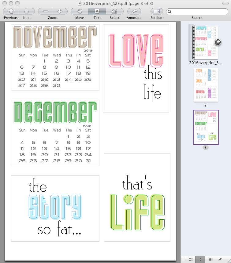
For most of my calendar files I have them saved in groups. in order.  So looking at this CD calendar:

2016cdworking backwards, I have:

  • the square locked in place
  • the entire middle grouped
  • the two halves of the scrollwork  and the white circle with the blue border grouped

then

  • all the month block info grouped
  • the Month name and 2016 grouped 
  • the sideways day abbreviations grouped
  • the columns of days grouped then grouped with that

The italic bit is what allows me to swap out a new dates block for a new year. What that means is I can UNGROUP things in reverse, and I only need to UNGROUP the centre (leaving the colour part and the month info part in the locked frame) and delete the colour part, leaving the month block intact. Align that block in the frame so there is more blank space at the top and Save then Save As >PDF.

Thinking about the groupings in a logical way when I made the calendar allowed me to create this blank to-decorate version in about 15 minutes.  It gave me a post for the day when I would otherwise have been too busy to sort something. So YAY! for that.

2016JanFebornateblank

But just to go back to the post title for a moment…I went out on a limb with this – my commenter just said she loved the original and would have liked a “blank version to decorate.” Fair enough, I THINK I know what she meant and I THINK what she wanted is this. But I could be wrong!  I don’t think I am, or I wouldn’t have taken the time – well, I did think to myself even if I WAS wrong I was making something that potentially might be useful LOL!

This was one of the easier comments to figure out, assuming I got it right, of course.  Sometimes the comment is so cryptic I have NO IDEA what the person wants.  If there is an email, I contact them directly and ask.  Sometimes I read their reply and think I did NOT see that coming! LOL! So if you want something specific, be really specific when you ask me.  Because my readership is pretty international, time zones come into play.  If you comment from the USA before you go to bed, I may get up, read the comment, have time to do whatever it is you asked for and have it posted on my blog or in the mail to you before you wake up – IF I know what you want SPECIFICALLY.

I should say that this in no way implies a contract between us, that I will do anything asked of me {wink} but I will read the request, consider how long it will take, if I have the time to do it, and if I’ll enjoy it or find it a challenge I want to take on.  And anything I make that isn’t super personal is not going to get saved for you and you alone (so yes, Jenny, that makes you exempt, fair dinkum! )  It’ll get shared with everyone.

Now, I have a million things to do before a big day on Saturday.


4 Comments

Keychain calendar additional months

A few people, over the years, have said when they make calendars they like to do the remaining months of the current year as well as the following year. Some like to do the following year and a bit of the year AFTER.

So I had a request for the remainder of 2015, in this 2016 key chain calendar I made, download found here.

ornatekey

I figured as long as I was going to do the next 5 months, I might as well do 5 months on the OTHER side, for 2017.  Five months work out as an even row, without me having to jump thru hoops to make sure it all fits for both A4 and US letter.  It’s a bonus, a bit of an extra for those who like to have a few extra months.  I altered the colours slightly so they don’t repeat

2015and17

That is just a slice from the middle – the actual sheet has two each of the five 2015 months and two each of the 2017 months.  I checked and re-checked, and used two different calendars just in case! You can grab the single sheet here. Hope they help!