scrappystickyinkymess


20 Comments

WOYWW256 – a bodge job

Hello all you WOYWWers!

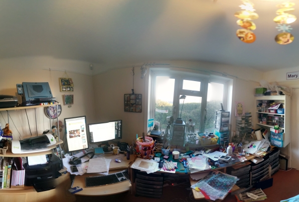
I have been toying with the idea of making actual videos (with motion, don’tcha know?) rather than my usual slide shows of still photos but have no actual video camera nor tripod.  I’ve seen the hint of legs in some videos, with people clearly angling their arms around tripods set onto the desk and wasn’t keen.  Also not keen on spending money on something that I may never actually take to.  So I had a bash at a trial (cheap) solution – be warned it possibly only works on MY desk, cause of how it’s set up.  I can already see improvements to be made (like thicker PVC pipe and threaded connectors that don’t rotate with the weight of the camera, but I’m getting ahead of myself…) but it will certainly work well enough for a test. No photosphere this week, but I did have a go at the panorama-shot function my camera has.

woyww256

No expanded view on this one, but you can see it isn’t quite the disaster it was two weeks ago, nor as neat and tidy as it was last week!

This shot shows the camera solution a bit better:

2woyww256

All it is, really,  is a few bits of PVC pipe and a couple of angle connectors and a couple of T connectors.  The problem is the camera is HEAVY so the connectors will rotate.  The long legs are shoved down between the desk and the radiator (to hold them in place) and the PVC pipe is inside longer metal pipes (scavenged from an old free-standing clothes rail, I think, been out in the garage for AGES, gathering dust) and the pip insulation (the rather fetching grey bit at the right) hold the two together.  In order to support the bit closest to you, with the large threaded screw (that just fits my camera tripod port) I simply extend one of the windowsill drawers to prop it up in place.

3woyww256

All I have to do is screw the camera onto the screw threads and turn it on.  Focus it, position the shot and hit record.  It works, although I’ve shot nothing interesting, just testing the process.  I have to rotate the clip in iMovie (just a click) and unless I want the soundtrack to be me babbling in real-time I have to get a microphone, but I think it will work.  It’s not a perfect solution but I can live with it at least long enough to see if it’s something I sill enjoy doing.  Not sure yet.

I’m working on creating more signatures for my envelope art journal, with an idea to maybe drop in to A Documented Life, and have one more idea to bring something additional to it, but I need to get all the pages ready before I can try that out.  Stay tuned!

Crazy bust week, but looking forward to some crafty snooping – and prep for a crop this weekend.  I have NO IDEA what I’ll work on… oh dear, and it’s Weds. already…. EEK!

Happy WOYWW.


3 Comments

A fire lit….
I follow a fellow WordPress blogger called KittyisnotAmused.  As she says, she is, at best, an intermittent blogger, with long pauses between posts- unlike me, who blathers on, day after day – but I often feel her posts are little gems.  Today was one.

I’ve created an art journal (AGAIN)  with no clear idea how I’ll be using it.  I still have space in the paper-bag one (although not that much) but I can feel myself slipping away again.  I need to reel myself in and tether to the journaling dock, lest I slip out to sea, IYKWIM.  I had read hints about A Documented Life and was curious, but there never seemed to be the time to really sit down and have a look at it.  Today I did.  Sounds like the kind of art journaling I can sink my teeth in to.  As I commented on Kitty’s blog, once you allow something to become a HABIT, then it becomes a hard habit to break LOL! This sort of perhaps daily journaling, with intermittent longer sessions to do the prompts, sound like the sort of thing I could do and really keep up with.  I do wish I had bothered to research it in JANUARY, but hey, ho.

So I though, as the current journal is still in progress, with only three signatures sewn in. I would take a quite radical step – brace yourselves:

snip

Yep. Snip Snip.

OK so that is the first task done.  The HARDER task is to sort out the already created signatures to accommodate the 2014 weekly layout.  Each signature is 8 sides, with one of them (or two of them, depending) left with a pocket from the envelopes I used to make the pages.

envelopeAJ

The question is, how do I arrange them so the pockets fall within the number of weeks for each month, so every month has a side for the prompt (rather than sticking a loose sheet in, as mentioned in the ADL project info) and there are no wasted sides??

The first thing I did was quickly Google the week layout of 2014.  I annotated it for myself, noting the monthly breaks and the number of pages I would need for each month.

2014weeks

It looks hard to read, but click the image and you can see it bigger. with that info I think I can now create the rest of the leaves so I can arrange them to ensure there is a pocket page within each month.  So long as I don’t get hung up on the pocket being the FIRST or the LAST leaf, then I think it’s do-able, although it might work out that, for example, two months share a pocket.  I’ll need to work thru it to see.

Another idea I had while reading Kitty’s post was that I could reinforce the envelopes by sewing the day divides on those pages.  That means deciding if I want to sew every one or if it works out better to sew most of them, but draw lines on the pocket pages so I can still use one side as a planner page – for months (most of them) where the 1st of the month falls mid-week (so a single week contains more than one month) I need to decide if I carry the days on in a continuous way or if I duplicate a week where part of it falls in one month and the rest in another.  My gut feeling is a continuous line, only because duplicating weeks that are split means more pages and as it is I think I’m just about going to manage it by doubling the signatures I have already made (24 leaves) and adding one more.

Then I have to decide if I want to go back thru iCal and deal with the weeks I’ve missed or just drop in well into the year?  I’m leaning towards hitting a few highlights based on my calendar, my blog, and e-mail, but not worry about something every single day.

I am thinking that making this my first small task every day, then doing the prompt art-page once a week is very manageable.  It feels like everything is sort of coming together, with all the pitfalls of journaling overcome.  Is that just wishful thinking?  Perhaps.  But at least I have a plan that has logical steps and I always work better that way.  So let’s see how I go…

Thanks for lighting the fire, Kitty….

(yes, I am aware that is probably not your REAL name but I’m struggling to find a place where you might have mentioned it…)


22 Comments

Printables or Cutting files (.svg) – you decide….

We have been having a lively discussion over on UKS.  You may have seen the recent printables that I made by request, that sprang out of that discussion.  One of the members commented that she might try cutting on of the printables I was asking them to look at, and it got me thinking about cutting files.  The lovely Doreen, who is that rare mix of knowledge and willing to share/teach, helped me immensely with just a couple of comments and a few screenshots, solve a problem that I didn’t know I had LOL!  That is the biggest issue in using a program I adore, but that no one else uses.  Who do you ask for help?

Anyway let’s try to be organized here. These are all based around Polaroid frames, that’s how it began.

1. Set One is a PRINTABLE –  Designed specifically for the UKS ladies:

forUKS

It was a bit of an experiment and I wasn’t 100% happy with the font.  I thought a stencil font would make sense, but it turns out getting the drop shadows right is tricky.  But I’ll add them here  in case anyone can use them. Note the very faint background.  I am experimenting with that instead of a fine line to show the card area.

2. Set Two is another printable – designed to address the font choice.

forarimum2

Both of these have the light source upper right.  That one is here.

3. Then I got a bit crazy and made these – just to see how they would work, basically.  But having made them I kinda feel like why NOT add them?  My issue with them is, as it is with every printable that is super ink-intense, is that depending on your printer, they may not be exactly economical.  KWIM?  Printer ink is not cheap.  But here you go:

hoveringgrid

I love ’em, and think they look cute as can be, but was a little worried (with all of them, actually) that the corner rounding debate (another UKS discussion – to round or not to round? and may heat up once the SU! Project Life cards (not rounded) get released) would mean only non-rounders would use them unless I really reduced the interior window.

SO that took me on to the cutting file idea.  A few experiments later and I ended up with these:

4. The .svg file (can’t add it here, so it’ll have to be DropBox if I can remember how to use it LOL!) looks like this:

converttoimage

and cut they look like this – you need to save the little ring from the camera and the thumbs-up then stick them to the backing card to complete the image.

3PLcards

3PLcards2

Note that these are rounded.  I took the extra step of finding a good image of a PL card online, then did my level best to match the corner as best I could.  I also looked at posts in a number of places that claim the ACTUAL size of a PL card is 2.9 x 3.9 inches.  So I made them that size.

Now if I did it right, you should be able to grab it on DropBox here. If not, comment and I’ll sort you out somehow.

Now I really really need to step away from the computer.  Love making printables, but I have a crop this Saturday, and my messy painty AJ play is calling to me, as well as another little experiment I am itching to test, plus the shopping, the laundry, and a few things going on with DD this week.  At the moment the Net and email are stable (knock wood, big time) and the car is repaired and available (more wood-knocking) and my To Do list is a mile long…including more paperwork to be filed, so much so that DH is beginning to regret passing on the filing to me.   I just really have to bite the bullet and finish it up… DOH!

Really, I almost feel every post should come with an Executive Summary at the top – just the facts and links, M’am... cause who actually reads every word?  LOL!


Leave a comment

White on Kraft week-cards for Project Life

Well, the poll has closed and the Subtle Drop Shadow won by a mile, with 41% of 31 voters picking that option. So, as promised, here it is! Not the greatest photo but I hope you can see well enough.  I was holding it, angled towards the window light, hence the crinkle in the paper LOL!

kraftweek

Enjoy. I hope those who didn’t vote for this option will still find a use for them. and thanks to those who voted.  The feedback was very much appreciated!


6 Comments

Blush quotes for Project Life

I enjoy the process of making Printables.  It allows me to experiment with my program, learn new tricks with it, and that is always fun.  Sometimes I have an idea and make something but then I don’t always get the feedback to know if they are really useful and used.  Knowing what people USE helps me focus my design work and not feel like it’s all a waste of time.  Last week I did a poll.  Not a ton of people responded but more people than usually comment so I feel like I did get useful info from doing it.  As that poll is closing tomorrow I thought I would repost it and update on the outcome.

And the sample – the winner so far is the last one:

whiteonkraft

Where it is now:

poll2

Anyway, I also asked for feedback on UKS, from the Project Life people on the quote one I posted as well.  It was good, a few people said they liked it, and one asked for more quotes, specifically in a colourway to coordinate with the Blush collections.  So I did that.  Here they are:

blushset

I added the little strip of paper dolls, thinking they could be cut and added to a photo, or some other filler card, and I had the space.  You can download the PDF here. Moms of teen girls may recognize the One Direction song lyric there (although fairly certain it was written by Ed Sheeran, and not the boys LOL!) Managed to avoid having to see the 1D movie out last summer in the theatre, but pretty sure DD won’t let me escape the video version for long.

One thing that got commented on is that so much of PL (and indeed scrapbooking) tends to spin positive.  I can recall long forum discussions about this in the past, with many people saying they would never scrap “bad” moments, that they didn’t want their books to be depressing.  Others were adamant that their books reflect all the ups and downs of life.  There is no answer to that one and will probably never be an agreement.  People will do what they will do.  So I thought I should make at least a few filler cards that at least give a nod to a less-than-perfect life without being deep, dark, and depressing.  The two on the right fit the bill.  I think of them as Silver Lining cards LOL!  Like the quote, while life may not be perfect, it can still be wonderful.  I may take the time to make a set of them – I have SO MANY quotes stockpiled for use, I’m sure I can find a few more.

On a side note, I do wish I had some idea what got posted on Facebook, and where,  that brought almost 1100 views to my blog in one day.  It seems to be one of my Big Card techniques (Ace of Clubs) but my stats won’t tell me more than that.  If you know, if that is what brought you here, clue me in!

Rather a busy weekend coming up – hope yours is a good one….


5 Comments

Bet you thought I abandoned that AJ…

…but I didn’t.  The envelopes are working well, I think, and I have the three sets sewn in with room for at least three more.

envelopeAJ

Some of the pages have the pockets but I really needed to extend the gesso further in.

The background was done with scribbles of the Inktense. and I used my fave silicone hot pad to stamp the hexagons – I just wiped over it first with a baby wipe then rubbed the Inktense block over it then stamped.

2envelopeAJ

a couple of my in-process shots didn’t save (had to recharge my camera batteries – DOH!) but I hope you get the idea.  Boy do they come up INTENSELY coloured.

You can see two bits that used gilding flakes.  The little flecks are just a few flakes that I dusted over the still damp acrylic medium. And then I dropped a chunk of drywall tape into the box and scrubbed off the excess.  The flakes stuck great to the adhesive on what os meant to be the BACK and I just stuck it down with other adhesive.

7envelopeAJ

I took some shots in the afternoon sun and some in the dismal overcast morning, hence the variations…You can see the spine in this shot.

4envelopeAJ

I also did a title to add, coloured with the blocks as well.

5envelopeAJ

Hard to see all the layers of colour but there are many….

And it will just fit, if overlapped, to the side of the flap. Considering many alternatives for the closure but I may end up with a bit of ribbon or fabric threaded thru the spine stitching and used as a tie.

6envelopeAJ

It’s fairly large, about 8.5 x 12, so plenty of room!  It’s big enough that I can actually slip into one of the pockets a few pages from one of my previous attempts at art journaling if I want to house all those pages in one place as that is more or less just a few sheets, folded and sewn into a pamphlet.  I only did maybe two completed pages and a background spread in it so I may disassemble it so I can slip those pages into a pocket, not sure yet.

My room is littered with floating shreds of gilding so it may be time to put that back on the shelf.  And while my room is still extremely tidy, my desk has devolved back into a bit of a mess…


16 Comments

Gilding flakes on Modelling paste

Rather scatterbrained today – our mail server has been down for nearly 2 days and the US ISP isn’t addressing it as quickly as we’d like, so worried I am missing out on some critical mail. But I guess that just leaves me more time to get crafty LOL!

So the shot of my desk yesterday showed an experiment.  I got a set of the Inktense blocks.  Frankly I wasn’t super keen on them until I read you can grate them and mix with water to create inks that are permanent when dry.  Now THAT is something I am very interested in.  My plan had been to have a go at this over some modelling paste, but as I had JUST tidied up (massively) and stuff I hadn’t used in ages was still in my short-term memory, I thought  I wonder…?

MPflakes

and grabbed my pot of gilding flakes.  My feeling was that the modelling paste, while wet, would grab the flakes.  When it dried, the flakes would not only be stuck, they would be stuck strong. So while the paste was damp (ie maybe 5 mins or so after applying? )  It should still glisten on the surface but if you touch it, it should feel semi-solid

2MPflakes

I scattered on some gilding flakes – this bag is one I got ages ago and the flakes are very large, almost like sheets, 2 or 3 inches square.  I laid them over gently, covering the surface on 1/2 of the modelling paste figure.

3MPflakes

I left the paste to dry totally then whisked away the flakes with a brush.  Personally, I think that scrubbie thing that comes with the flakes dulls the shine so I don’t really use it.

4MPflakes

I think the bare areas might have been down to me not pressing the flakes into the paste or, for the tiny areas, that bit being drier than the rest.  But overall I felt the coverage was good and I was able to whisk pretty briskly and the flakes stayed stuck.

So what I expected to work was to re-lay the stencil then sponge the FlitterGlu over the dried modelling paste then gild as usual.

5MPflakes

I did that on the OTHER half.  And it worked as expected. So far so good.  I left it for a while to make sure the paste and glue was dry.  Then I grated up some of the Inktense block, mixed in a bit of water, and make a spray.  Easy Peasy.

8MPflakes

I sprayed that over the gilded area, and let it dry.

9MPflakes

Nice and watercolour-y – you can vary the vibrancy by adding more (or less) water. Now here is where it gets odd.  What I hoped to do was buff away the ink before it totally dried (’cause I keep hearing it is PERMANENT WHEN DRY) to reveal the gilded areas.

Yeah. Right.

So what I had read, and seen on videos, is that you can layer other wet mediums over he Inktense and it will not smear.  With this in mind I used a slightly damp baby wipe to wipe away the mist from the surface of the gilding flakes.  Two things to note – first, the flakes that were embedded in the modelling paste stayed put nicely.  The ones applied over the FlitterGlu?  Not so much.

10MPflakes

The left is the FlitterGlu.  But I also noted that the Inktense spray DID wipe away, at least partially. Not so water-fast then.

I suspect I need to experiment a little more with this.  But overall, I like the application of the gilding flakes over the modelling paste idea.  It could be quite an interesting technique on an AJ page, certainly for a top layer.  Likewise, I suspect glitter would embed nicely – and if it were a top layer then the FlitterGlu method would work as well, but why add another consumable resource if you don’t need to IYKWIM?  As to the Inktense mists, again, more testing.  Maybe heat setting it for longer rather than just letting it dry might help it remain water-resistant , not sure.  I know it is easy to scribble with the block then blend with a baby wipe and not wipe it away totally so it is at least slightly water-resistant.  And the colour is rich and deep.  But I am glad I had a go at the idea on a piece of paper rather than in my AJ.  I think I’ll enjoy pushing these blocks to their artistic limits, trying out a few ideas I have, to see what works. And I’ll be sure to report back!


36 Comments

WOYWW 255 – so clean!

NOTE: Click the small sphere photos once to see them bigger, then click again to scroll to see far too much detail….

WOYWWers who visit me on other days may recall that last week after Wednesday I posted a photo sphere of my desk.  Well, I realized just how bad my room had gotten when looking at that shot so I decided to have a proper tidy up and take  another one of the WHOLE room.  Here is a repeat of last week’s messy shot.

desksphere

Clicking it will bring up a bigger view. Just popping back to add that if you want to get the app that I used to create this (and I used DH’s Android phone and a Google app, but also link an untested iPhone app)  you can find both linked in the post here.

Now here is THIS week’s shot.  Brace yourselves.

WOYWW255small

Now, there are a few oddities, it wasn’t a completely smooth merge.  You can see the four corners of the room marked by the arrows, just to give you the basic idea.  At those points there are some stretched or squished bits but overall it’s a pretty accurate view.

What is on my DESK at the moment is a bit of an experiment that I will have to finish up and report back on tomorrow.

woyww2552

It looks interesting I’m sure but it’s actually two halves with a technique on each half.  One was a success and the other … wasn’t.  Interestingly the one that I EXPECTED to work, that SHOULD have worked, didn’t, and the one that I thought was a long shot worked better than I expected.  But I really need to try again with a longer drying time with the logical choice before I’m going to write it off.  Then I’ll share both.  Sorry to seem mysterious but I just would rather be sure.

Happy WOYWW y’all!


3 Comments

Project Life quote – an experiment

I fear I am in danger of littering my blog with polls!  I am finding the results of the one for the white-on-kraft printables quite exciting – so sad, I know.

Here is where the voting stands so far:

poll

I have another set I’ve been dithering about for a bit.  I quite like it, and the idea of how to use it, and I am only barely restraining myself from making it a poll as well!  So I’m just going to add it and perhaps may poll on the usefulness of it at some later date, as I have a stack of these sorts of quotes that I think would work this way.

It’s a two page PDF with oriented one PORTRAIT and one LANDSCAPE – each page has:

  • the quote, split across 3 small cards
  • the quote, in full, on a matching 4 x 6 cards
  • a trio of small arrows

Like so:

quotex3P

My thought is they can be used in a few ways.

  • 1. Use all three to make the full quote, in a row of pockets
  • 2. Use card 2 and card 3 side-by-side for a more overtly positive quote
  • 3. Use just card 1 for a not-very-good day (I can see that working in a spread about some tearful episode, matched with a final smiling photo.  Kids tend to do that, don’t they?)
  • 4. Scatter the 2 or 3 cards and use the arrows to direct the eye OR use the arrows to direct to a photo that applies.  You can point them any way you need to.

There may be more but those were sort of what I had in mind.

3partsample

Two things to note – I printed that before I adjusted the sun – it’s more like the image above, thinner so less in-your-face. Next, the background is a bit pale in the PHOTO but it PRINTS (depending on you colour profile, obviously) more like the traditional yellow-tablet colour, again more like the image.

I spent yesterday on a task that was LONG overdue.  You’ll have to check back tomorrow for WOYWW to see the results.  {wink}


4 Comments

Week cards – white on kraft? A poll

I am experimenting today.  I got a comment on the colourful weekly Project Life cards asking about them in white on kraft.  Had a bit of a play and I can’t seem to work out a way to do the textured strip that I am happy with.  But I did come up with a few alternatives that I like well enough.  It’s still a lot of work to convert them, so I went hunting for info to see if it’s possible to do a poll.  Turns out not only is it possible but it’s easy.  So I thought I would have a go.  Thing is, I know that a lot of people visit me but I also know that commenting on a WordPress blog defeats some people.  I’ve tried to make it easy but it still isn’t as easy as for a Blogger blogger to comment on another Blogger blog (say that 5 times fast!)

This is what I came up with:

whiteonkraft

Bearing in mind that view is zoomed in, so the Kraft card looks pixelated, even when printed.  But the ACTUAL cards won’t be cause they won’t be stretched to fill a page.

So what are the (subtle differences?

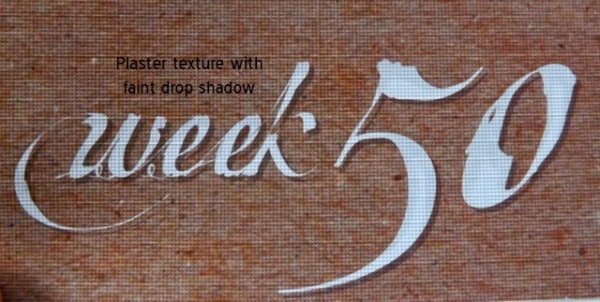
1. Plaster texture with a bold drop shadow

1whiteonkraft

That is printed on linen photo paper.  Mistake, as it makes the texture harder to see but maybe you can see it at the arrow?

2. Flat white text, resting on a line, with a faint brown drop shadow

2whiteonkraft

I may add the drop shadow to the LINE as well.  I’ll have to see how it looks.

3. Plaster texture, different drop shadow

3whiteonkraft

The goal here was to make it look a bit like dimensional modelling paste.  I think the texture is more obvious here.

Of course all of this is going to be even LESS obvious one they get slipped into the photo sleeves, so to be honest it might just be a waste of time.  But I’m curious to know if people will bother.  I accept that perhaps a HOLIDAY may not be the best time to test this out LOL!

So here we go.  A poll!

I’ve left it open for a week.  I’ll be very curious to see what happens.

Happy Easter….