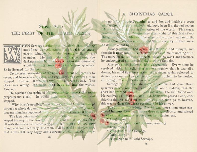
Another lovely festive journal kit! This one uses a vintage 1800s printing of A Christmas Carol. Colourwise, I think it could work along with the Pickwick Chirstmas kit.
I like the central wreath, as you can add it as a centre page in a journal and the whole image makes a lovely visual, but likewise you can position it so you see the left page in one place and the right in another.
Just a quick drop in and a scheduled WOYWW 760 post while I spend time with Family! I thought I would share our holiday tables. Love the “floating candles” in the window – when we bought them the lady said “Oh these are so pretty but a lot of work!” I made it easy by adding a bit of nano tape for each one (they hang from thin threads) on an old tension rod then wrap the threads around to vary the hang length and install all of them at once. I am so lazy, but also clever LOL!
Darling Daughter has the Twinklys on the tree set as a cascade of Christmas colours from tip to trunk. Very pretty! Not been near my desk in AGES, so no desk shot at all, again.
For today’s freebie, I went a bit brighter and less vintage, but it might appeal to those not loving the sepia tones.
Maybe play around with editing it? Using just the Mac adjust colour tolls in Preview I altered it to tone better with the previous kits. Well, I think so anyway!
Maybe the reds need a little more work but you get the idea! The point is, have a play – you might be surprised with how you can alter the colours with simple tools.
Tomorrow a special extra download, not just another signature!
Despite a rocky start, my attempt to acquire the daily journaling (or morning journaling, if you prefer) habit has been a success. I now feel how I would miss it if I was not doing it, and recognize the pull of it when I first sit down at my desk. That’s a result for sure.
I picked the paper for the December journal, as I mentioned ysterday, because I worried making in in time after we get back from our trip might be a struggle.
I did amp up the colour a bit. But again the screen image is not exactly like the printed image. Anyway. My process is to print the cover image on my 210 gsm coated cardstock, then stick that to my stash of thick linen texture white cardstock to make the cover. I’ll fold over the sides and add a bit of decorative washi tape to the inside.
That makes a nice weight cover without the need to use up all my cereal-box card. Then I had to go in search of a letter sticker sheet. Ha. dEcEmbEr. I looked thru my stash and I struggled to find sheets with TWO Es let alone THREE. Look at this:
I mean come ON! I had multiple sheets, clearly from more than one pack of these, with zero lower case e’s. What’s a girl to do?
OK so a few points:
the inside of this one has the brown recycled packaging paper. 2024, I think I may opt for plain white paper. It’s more archival. We’ll see.
this one has just the month name on the cover. Next year I plan to add the year on the cover as well.
the white linen card + printed paper works very well, weight-wise. It’s sturdy and it will stand up to daily use, at least for the month.
I am pretty happy with this decision, and like the idea of using my own papers to cover the journals, not just random, unused gel prints. I think the white paper will be an adjustment (golly it is really WHITE!) but I think it will be OK once I get used to it.
My next thing to decide is what to do while I am away. I am not really one for blogging from the road, so it may be a case of a few days of old favourites coming back, or I may add some digital downloads, calendars and the like, so people who are looking for 2024 ones (in addition to the ones already shared here) can use them for making their new planners and/or gifts. I’ll think on it – I will have to make those things so yeah, that might be a bit of a struggle.
…I managed to do very nearly daily journaling for every month since about April. I set my mind to it and made it happen. It wasn’t always easy, and did I occasionally write the previous day’s entry before the present day? Yes, but only very occasionally. Remember my collected book of January-June?
I am anxious to make my book for July to December. But I seem to have misplaced the sheet that was the off-cut from this one! But before that, the final project for the August Fodder School was a journal. It was more junk-y but instead I made my November daily journal. To be honest it was no different to how I make then myself, but instead of waste packing paper I used a selection of scrap papers, and a fair few end-papers from old books.
My collection of journals is lovely and varied.
and the one from the class fits right in, don’t you think?
I would say the only difference is it is much thicker, cause the packing paper is quite thin and flimsy. So just the December one to make and the collection binder. I do wish I had made a normal one for November as it would be easier to take with me as I travel. Oh well.
I have a few months to consider how I might change the basic journals for 2024. Now is the time to settle on that, because once I make one, they will need to all follow the same basic style and dimensions in order to be collected up like these.
I am really loving my August journal and as I had all my scraps and samples out for ICAD I figured I might as well go ahead and make a couple of journals in advance. It feels safer having a month or two in the bank!
I loved this sample, I think it was a deli paper print coated liberally with Gloss medium
That made me one cover. The inside ended up being more of a collage of scraps
The other was also a couple of gel plate prints that were more or less A4 size so not a lot that needed doing to those
That leafy stencil has to be one of my oldest ones!
Might go ahead and outline those pale blue letters, although it does look better IRL than in the photo! I have that lovely white and gold gel print to use for the December journal, so really I only need two more, October and November. I am astonished myself that I managed to keep this going as long as I have and am happy to keep doing it moving forward. So many challenges are over when they are over IYKWIM. This one has become an ingrained habit and I like both getting my head clear in the morning of all the stuff that rattles about and making a record.
Fodder School stuff all weekend I think. Just so much to choose from I am not sure where to begin! It’s also Cropredy for The Hubster and Dear Son, so Darling Daughter and I will probably do a lot of playing with hair extensions and spa treatments. You know, girlie things. Oh. Joy.
Now my June daily journal is done, and it’s clear the “traveler’s notebook” style cover is far too small to house them all, I decided to make a larger version for the first six months, and will do a second one for the last six. Happy to be into my July journal.
Oatmeal box size was perfect, but for the next one I think I will further reinforce the spine area.
I decided to use my hands-down favourite scrap. I wanted the two for 2023 to match so I made sure to cut each piece in half and figure out how to make something I liked from each pile. I used the favourite piece for the cover and a mop-up piece for the back cover.
I made added the elastic to hold the books, traveler-syle
and done!
And so on to Card 33! An easy one, as the journal took a bit of time and effort. I found this little…kit, I guess, with no clear idea of where the heck it came from. Very much not my style, but I could see how it would fit together to make an ICAD
and it did. I have been a bit grumpy lately, due to test results that were less good than hoped. A reminder to be…less so.
I did so well in May with my everyday journaling, that my decision to only add 7 sheets to the signature came back to bite me in the butt!
I have a single leaf left so had to draw a line across the middle and limit my writing to make sure it fit. Having said that, I believe I did have a couple of days when I overshot and filled the side and then some. Overall, I think the seven folded sheets for 28 sides really is, most months, enough. Even if I do every day, I am sure I can limit myself to a half-page some days, or might end up skipping a day, thru intent or inattention.
SO. I quite liked the washi tape decor, but dd not want to deal with sewing thru the sticky again, so instead I grabbed some pretty tapes (gift from the Hubster and Darling Daughter for Mother’s Day, I think) and used it instead to edge the pages. Much better choice and very cute indeed. Especially all the tapes with Lucky Cats on them.
I grabbed my stash of papers and pulled out two that I had planned on using, but they really didn’t go at all with the washi tape and the feel of the pages I had already done!
Dear me. I went back and grabbed one of the gel print colour challenge sheets and I felt like it went perfectly. Love those cats!
The very first sheet from my stash of liner papers was perfect so I just went with it – the gold-y shimmer was perfect. Bonus? I went ahead and made the July cover from the papers I had wanted to use, so I am ahead of the game, for once. Whoo hoo!
My last few WOYWW Anniversary ATCs have arrived so will share them tomorrow and consider what neat trick I may come up with fer next year…
I was working on a set of journal cards, based on an old library check-out card, but trimmed with digital lace. Not sure when it will appear on Creative Fabrica, but when it does it will be here. Here is a preview:
Editing the original file took a bit of time, and it was interesting – not sure what I did or why it affected the file, but Inpainting simple did not work on some of the lines. I had to go back to the clone stamp, which felt slow and cumbersome by comparison. Anyway, another thing I was working on at the same time, swapping mentally between them, because I could not decide which one to focus on, was a set with tiny little birdies. They came from one of the printer’s sample books, from a sheet like this:
all those tiny little sweet images! Anyway, I was working on them and as the images are mostly transparent (due to previous editing, not from the original!) I found I needed to edit the lines on the cards in order to make them look right. I am sure you will have seen these exact little guys before, as stamps or printed on papers. Public domain so free for anyone (who can find them) to use them!
I was struggling with what to bundle them with, but I realized it has been a while since I added a freebie. I mean, for CF subscribers, all the stuff I have been adding is technically free, but for my blog readers it’s different. I am still hovering on the edge of being out of space, so I will add the actual download on Ko-fi here. Also still not worked out how best to add stuff there, and link it here so both the blog post and the download are live simultaneously! So if you go there and it is not live, just go back and it will be later in the day. I’ll pop them in to Creative Fabrica as a freebie as well.
I think they are very cute and I like that there are lines – my writing goes super wonky if I am not concentrating super hard as I write LOL! I like the 5 x 3.5 size, fits even fairly small journals, and the colour is quite vintage-y.
An interesting point. I felt like I could position the birds so it looked like they were sitting on one of the lines, but when I did, it looked more like they were floating. Leaving the existing line (wire?) hovering just over the line on the cards really makes it look like they are sitting on something. Optical illusion? Don’t know, but I know what I like…and I hope you like them too!
I have been working on a set pf journal signature printable pages that will work nicely with a previous design,and when it came to the final edging, I spent far too much time working thru the long list of blend modes and struggling to identify which one I liked best. Some of them are so close, you can barely pick between them, and some are really different but still appealing in some way. I tried to work out the best way to capture them and this is what I came up with.
So Negation and Add (at least on my monitors) look very similar. There is also not a ton of difference between Pin Light and Hard Light (and that I find to be true for most things, but not all)while Difference is much more on the grey scale and Colour-dodge much more on the brown. Linear Light is warmer and Glow is more … beige? Arrgghh! I mean, how do you decide? and as I probably too casually mentioned, this is MY monitors, with it’s own colour sync and settings. I wonder what it looks like on your monitors?
I feel like I have narrowed it down to Linear Light, Glow, and Add. To be fair, some of that decision is based on the bits of the piece you can’t see, cause I’m not done with the set yet. In fact, even now I think I am mentally discarding Glow. I feel like Add ties in nicely with the already blended damask colour-wise, while Linear Light offers a bit of warmth, which could easily be amped up with some inked edges in a darker sepia tone. Although maybe the warmth is the problem cause the background is cooler maybe?
Arrgghh!
I will share a page, as I am confident I will have finished and added the set before this publishes. I love it, overall, and think it will work so well with the other colour-wheel set. So much so I may have to make a journal with it myself.
Well I cut it close this time, even knowing weeks ago I should make the May journal. I didn’t. Once I got into the ATC making, honestly, it was pretty all consuming. I know I have weeks, but I also know the design was not straightforward, thee were many elements, I was planning to make A LOT. More than I have for any swap previously – except maybe the little Mr Spikey guys for the crop swap. I made a freakin’ ton of those! Can you believe that was for the 5th Anniversary crop??
So yeah, I had set aside some paper that I really liked (both roll-off sheets) and as time was short, I just went for it with them.
The one that is hiding it the cover, the purple-y one the inside.
I cannot photo the cover paper in any way that does it justice. I added the extra text Every Day as a reminder not to let my day begin without at least a line or two. It wasn’t just not making the journal but also the long gap in the middle between when I determined what the ATC design was going to be and when I finished at least the 17 I had laid out (with an additional three with bits assembled in case I need them) where I missed journaling completely. Again.
I had bought a bunch of cute washi tape in the Paperchase closing down sale and had the idea to line the crease of the pages with a selection. NOT a good idea. It may not be very sticky but it is sticky. Doing the pamphlet stitch thru the tape was not easy. I won’t make that mistake again either! Looks cute tho’…
and I love the cover.
I swear I have so many letter stickers I could actually journal with them! But this one was one that both matched the cover AND had an A left LOL!
So there we go – January thru May is done. Phew. And I am using it. Yay!


