OK, I am still trying to work out a good way to share book folding alphabets that are easy for people to use. While it us certainly easy enough, with the right tools and knowledge, for you to copy>paste individual letters and build a word you then can print out, past experience has told me that most people don’t have either the tools or the knowledge. Most people have a printer. so, sure, it’s a pain if you have to print 5 copies of the vowel sheets (and in future I might opt to put the vowels across two sheets, cause then at least if you have to print multiple copies, the extras will be useful! Now I think of it, it might be useful to group the consonants according the those you use most often as well. But I digress…
So this is a pretty plain, blocky, no serif font, easy to fold for a beginner and chunky enough to really show up when folded.
Print the count page (page one) and all the pages with the letters you need.


Keep the page count sheet with your extra letters. As you count the lines, fill in the sheet so you never have to count that letter again!

Cut out the letters you need

Note the * – those letters are ones that are not aligned to the bottom edge. You will have to adjust the placement of them as you will see later.
Get a plain piece of paper and fold over the edge. This is what hooks over the pages of the book to keep your folds aligned.

Draw a couple of lines, three inches apart. Bear in mind the height of your book. you can place the folded edge over the top of your book and mark where you want the top of the word to fall, then mark that on the paper and draw the bottom line three inches from that. The blocks that hold the letters are three inches tall so they will line up within that area.

Now simply use the lines of the letter blocks to stick the letters to the plain paper.

If you like to fold back pages between the letters to create the look of a space, leave a gap then assign that however many pages you like, and five is usually good for me. For most letters, ones that are NOT two uprights next to each other (like “like” for example – the l and the i and the k need space between them) can do without a space, but feel free to practice in a cheap paperback and see what you think. Or cut the letters right to the edge and butt them up to each other.
The *ed letters need to be placed more carefully.

You can hold them up to the light and line up the bottom edge of the body of the letter (i.e. not the tail) with the line you drew, like so:

This will also help you make longer words – provided you can find a book that is big enough!
The letters are pre-stretched by about 50%, all the same amount except the W which was just SO wide it is more like 25% more. It should be one of the easiest alphabets to try as a beginner and should give you a good result.
Here is the alphabet, upper and lower case, 1-0 numbers, a heart and an &. That lets you do a couple’s initials, like A {heart} B or Mr & Mrs or 01 {heart} 05{heart} 2015 (like an anniversary or birthday) with ease
Gabo Drive font for book folding (and the fold count sheet)
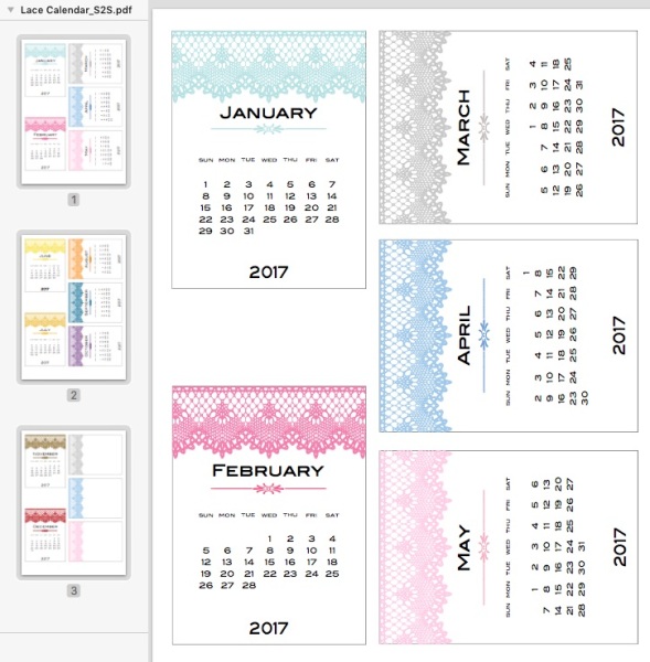
Calendar folk, come back maybe tomorrow and I should have the Lace design done for Monday to Sunday calendars! The Sunday to Saturday version is here (including a French version)