scrappystickyinkymess


8 Comments

ATCs done

Fairly happy with at least 5 of the 6 I made.  The group:

xmasATC

While I like the IDEA of the mostly text one, I’m not wild about my execution.  Might scrap it or re-do it, not sure:

3xmasATC

It’s a bit of a pet peeve of mine, having ATCs with stuff hanging outside what will fit in the sleeves so the strip of considered and rejected Christmas greetings are meant to collapse.

And I really like these two in particular – I checked the official Christmas Countdown online to get the exact timing between NOW and CHRISTMAS for the circle.  It really is QUITE a long time away….

2xmasATC

The Santa is another of the 2Peas font (and I see you can download it for free from here now so perhaps other 2Peas freebies are still out there to be found) and the screaming man still unknown.  If I ever get the info on that old image bundle I bought I’ll let you know.

In general I do think I demonstrated that printables CAN be used quite nicely in other ways, not just for Project Life, or indeed just for scrapbooking.

Now, time to consider moving on to more season appropriate crafting….. {wink}


40 Comments

WOYWW 269 – Christmas in July

I am still making anti-Christmas in summer ATCs using my printables.  I’m quite liking how they are turning out.

I thought this week I would take a shot from a different angle, just to show you that my mess is NOT confined to just the “working area” of my desk:

woyww269

It really is that bad, from one end to the other.  {sigh}

And the working square is just about tolerable:

2woyww269

You can see the Bah Humbug ATC from yesterday as well as the other three in my set of four:

3woyww269

The bag of coal needs some more text – I’m leaning towards “not bloody likely” to answer the Been Good? question and explain  the bag of coal.  The screaming man is an old image I think I bought back in 1999, for UKS – I used it a lot when I wrote the Scrap Musings.  Always liked it and the images are VERY large and thus high quality – I saw no reason they wouldn’t work as “digital stamps” but they seem to have disappeared from the site where I bought them.  The tech support team in on the case.  This guy is def. my favourite but there were a few others I quite liked as well.  We’ll see if they find them.

The other images are dingbats – the Bag o’ Coal and the little boy catching snowflakes are from David Wilson fonts from 2 Peas – shame they won’t be available anymore.  The snowman is built from white cardstock circles, and the face is a bit of a pumpkin carving font, some black dots and a clip art carrot.  The grasping arm is a bit of a Stampotique stamp.  I think he looks suitably scary, don’t you?

6woyww269

You can’t see the Diamond Dust snow very well but it’s there – might punch some tiny white snowflakes as well.

Now last week got away from me – I was busy on Weds. with DD all day, and it was Sunday morning before I realized I never got to even one desk last week.  Oh the SHAME of it all – I am thinking (although Weds. is still skating day AND we have haircuts booked AND DD is home with me all day and craves girlie time when that happens) I may try and see if for once I can visit every blog on the list.  I won’t say comment cause some people only allow comments from Google accounts and some just will not accept my input for some unknown reason. But my plan is to visit everyone.  Never done it before and it’s time I made the effort – if for no other reason than to make up for my poor showing last week!

So, see you round yours in a bit…but if I see Christmas cards …..

🙂

(update: PHEW! visited every desk and only found 3 or so that only allowed Google comments so I couldn’t say how much I like what I saw – that was a challenge but glad I managed it at least ONCE!!)


3 Comments

What else I did with my printables

I did say I wanted to have a go at the printables used in other ways – so I had a go. I don’t think they are going to win any prizes but I like them well enough. If I printed the sheet and only used one or two of them, then I could use the other ones for something useful.

The ATC is just because I am always moaning about people who get started on Christmas when the weather is as hot as it is now (I exempt those Down Under, as Christmas IS Summertime, I think, if my years of watching Home & Away serve me well LOL!) and yes I KNOW I have been making calendars already, but I have been dying to use this little dingbat guy for AGES and he just seemed to glower and mutter Bah Humbug! to me so what could I do but

printATC

The clear granules are actually Diamond Dust and not unheated embossing powder, just in case you wondered.

I had the rest of the cut cards scattered across my desk, all overlapping, and this colour combo just called out to me.  Simple enough, and the cards work well on this 5 x 5 card, I think. Again, nothing to write home about, but if yo need a card quick, you can’t really get too much quicker than this

printCard

Care to bet on another catastrophic WOYWW post tomorrow?  If the glimpse behind the card to my desk is any indication (and of course I can see the whole appalling mess from my viewpoint) that is a bet I would take if I were you – but then I MAY just surprise you and tidy up…who knows?


10 Comments

Funky filler cards for Project Life

Did you miss me?  I’ve been very good about blogging every day but yesterday I had a very very (all too rare) family day off at Earl’s Court for the Hyper Japan show.  Regardless of what *I* thought, the important thing is DD had a GREAT time.

I have been trying to learn a few new skills and that informs the designs for my printables today.  I am playing with blending and colour adjustments and all manner of things I have never tried before.  I’ll let the download statistics tell me if they are a success or simply too OUT THERE for most people.  There are two downloads.  The first has all of these cards.  funky

Oddly, for me anyway, they are PURE FILLER cards – no text, nothing, just pattern and colour.  Grab them here.

Just because they are filler cards doesn’t mean they are one-use only.  The can be cut, for example, to make tabs or photo adornments.

2funky

Just a few of the tools you can use.  And they look quite cute cut like that

3funky

The really shaped ones, stuck back to back on the edge of a page, would make quite colourful tabs – I don’t have a tab punch but would 3 x 4 be enough to punch one?  Do tell….

There is another set here.  I split them because I guess I thought people might like the first set a lot more than this one – it’s a bit different, and perhaps not something that would work with a huge number of other printables, I just don’t know.  But I thought it best not to force you to take THIS set if you liked and wanted the OTHER one by bundling them into one PDF.

4funky

I really like the base pattern and the colour play came up with what I think are some pretty nifty alternative versions.

5funky

I figured since I made them I would share them.  But I’d be curious to hear if this sort of thing appeals to you or not.

In any case I did learn quite a lot in the process so for me it was a WIN, even if no one but me actually likes them.  Personally I think they would look very cool as fabric, but that is a play for when I am sewing obsessed.  And I might have a go at some sort of card using them, not sure – either that or ATCs. I still have that pile of Creative Palette prints kicking around on my desk so that might prompt an ATC making day – but I really, really, need to swap them if I make them.  I am SO BAD at that.  Off to check out the ATC Trail thread on UKS…


5 Comments

Long labels sized for Project life – with an addition

So I am still working to satisfy the request from a UKS member for labels.  I have a couple more designs but somehow I managed to overwrite my working file – DOH!  It may have to wait for more time till I complete them.  Anyway the labels look like this:

labelsfor4x6

The PDF has both the larger (about 3 1/2 inch long) ones and the resized smaller about 2 1/2 inch ones.  That SHOULD make them work on any size PL card!

What’s the addition, you ask?  WELL – the original requestor asked for a mix, some with words, some plain.  I REALLY struggle with those design decisions.  I can’t tell you the number of times I sat staring at a set of printed embellishments and thought Blast!  I wish that perfect-for-my-photo little label or star or circle was in BLUE not PINK! So coming from the other side of things I was left with a choice – do I make them all blank so people can add what they want to what colour they want OR do *I* arbitrarily decide to make THIS one red and THAT one purple and tough luck if you really wanted them the other way round? OR (heaven forbid!) do I make each colour with each word??

Now I know what I usually suggest is that you just either write (or stamp or print) what you like on them and you can surely do that.  But I also considered that some people may not have any idea WHAT they want on there.  And don’t want to think too hard about it.  When I ASK people to give me specifics they often say things like Oh just a nice mix or give two examples and say Words like that... I considered how I might address that.  So I made two sheets – the same set of words/phrases, repeated four times, in four different fonts.  So if you don’t want to think about things too hard just pick the ones you like, rough cut them and stick the label size and colour you like over the words with temp adhesive  then run it thru the printer again – to be honest I don’t see why you couldn’t stick them to the printed sheet and cut thru BOTH sheets, if your printer paper is fairly thin weight so you only have to trim closely ONCE! The advantage is you can position the words left, right, centred, however you want.  They are spaced so you can over print a lot of them at once. And see the one green roundy one?  I cut that in half before printing on it so I got two smaller ones.  Just another option for you!

Here is a little gallery of some of them, shown printed in different positions and on both sizes – click on one to see it slightly bigger:

The fonts are a mix – personally, I think the heavier ones work on either the blank (white) ones OR the grid ones, but the finer fonts stand out less on the grid.

And if you REALLY hate cutting out, leave them as true rectangles – I don’t think they look horrible like that!

2longlabels

The rounded edge ones look cute but I know a lot of people struggle to cut nice rounds.  You can always drag a chisel tip pen around the edge or Distress Ink them if your trimming is less than precise, to hide the white halo.

Why can’t you print the whole word sheet over the large label page?  Well, keep in mind your printer will “grab” the paper slightly differently every time – look at the printed sheet – you can see the first print doesn’t line up perfectly (and of course you are then going to only get one word or phrase on one colour choice!  Kinda defeats the purpose of the word sheet, doesn’t it?  {wink} And you can see even the larger labels work on the 3 x 4 cards or photos.

8longlabels

You can always print JUST the word sheets on plain cardstock too, if you like them and can’t be bothered to create your own text file!

Two sheets – I didn’t combine them into one PDF because you may not love all the fonts so you can grab just the ones you do like.  One slightly grunge, one very plain set here and one fairly funky, one pretty and scripty here.

Hope they prove useful to you.


6 Comments

Creative Palette with pigment ink

I had a further play with the Creative Palette with acrylic paint the other day, and my results, no matter what I tried, were equally disappointing.  I tried a prussian blue chalk ink on it, thinking inks might work, but it stained the circle very BLUE and nothing I did would remove it. I stuffed it in the sleeve and on the shelf and decided that I would waste no more time with it.  I was going to blog all the things I tried but then I thought Why bother? I’ve already said it was an epic FAIL for me and nothing I said was going to expand on that.  But then an odd thing happened – I turned on the TV at just about 6 pm, ready to set up a recording for DD and the TV happened to be on Create & Craft.  Odd, cause I haven’t watched it for DAYS.  In the seconds before it went off the air on Freeview I noticed mention of CREATIVE PALETTE!  I went to the website to watch the show, which had been on at 3 PM, I think, and watched the bit where the guest demoed the CP with Crafter’s Ink re-inkers.  Crafter’s ink is just pigment ink that can be heat set and becomes permanent.

A dim memory surfaced.  I had a handful of little bottles of pigment ink re-inkers that I swear I bought 20 years ago, most of them had never been opened.  I dragged them out and sat down to have a play.

Creativepalettepigment

One thing the guest mentioned was that she brayers on some hand sanitizer first, then adds the pigment ink.  I did do that for the first few ones, but to be honest in the end I mostly skipped that step – the pigment ink stays wet enough without it.

It worked.

3Creativepalettepigment

That is a couple of colours, with one of my Gelli Plate anaglypta wallpaper samples pressed in to it then the print pulled.

Very Gelli plate like! But with pigment ink not paint.  Softer, chalkier.  Pretty. But worth the effort?  Maybe.

So then I tried a stamp. In general my success was only with removing the ink on the palette and letting the lighter/white space do the talking:

5Creativepalettepigment

This was a big, rubber background stamp. The tone-on-tone look is OK, I just wonder how worth it it is.  Could I get close enough to a similar effect by just stamping?

Foam stamps really remove the ink – not ones that are caked with paint from Gelli play, but fairly clean ones:

6Creativepalettepigment

The was probably the last one that I used the hand sanitizer first.  I think that and the too heavy layer of ink muddied the print too much:

7Creativepalettepigment

Still it was mildly interesting. A MUCH thiner layer of ink now, but I didn’t clean off the blue.

8Creativepalettepigment

I really liked that one.  And this one – more blue over the top, big bubble wrap, and you can still see the foam stamp impression.

9Creativepalettepigment

One of my favourites for sure.   Another foam stamp cut from one of the Die Delights.

13Creativepalettepigment

I thought I could brayer on the pigment ink from an ink pad, so I did – this is one of those multi-colour strip pads. It is very light, and as the bubble wrap still had wet ink on it I pressed that to the palette to transfer the ink for another layer

12Creativepalettepigment

Keeping the brayer in position gave me a rainbow effect when I brayers the ink on.  It is a bit more vibrant than it looks here.

I tried brayering on gome mossy green then stamped over that on the palette with some copper:

14Creativepalettepigment

Again, the photo doesn’t do it justice, but why not just brayer the ink onto paper then over-stamp?  The palette really doesn’t ADD anything to the process, except for a slight more…atmospheric look, I guess.

I then HAD to try a stencil.  I still felt that HAND CUT (so much thinner) stencils would give a better impression and they did, but still not what I would call sharp and defined.

10Creativepalettepigment

You maybe can see I first ran one of my foam shape rollers over the plate to give it some added interest.  Again, the stencil was loaded with ink so I pressed that onto another earlier attempt that wasn’t brilliant – I think I tried something I thought I heard on the show, which was that hand sanitizer would re-activate the ink.   I brayered it on over some leftover ink after that first, very un-defined foam stamp print and that gave me the background you see here:

11Creativepalettepigment

And that one was REALLY cool.

So here is the array:

15Creativepalettepigment

Some maybe worth keeping (probably great for ATC backgrounds) but I am still not convinced this is something I am going to do a lot of.   Oh, I just noticed – that single foam stamp towards the right?  Between the blue and bubble one?  Fo THAT one I simply pressed and small pigment ink pad onto the palette.  The pattern of small overlapping squares was neat, and def worth playing with.

Final thoughts on this?

  • if you are using re-inkers keep he application light – small dots of ink scattered across the palette.  Hand sanitizer first will help a think layer cover.  Too much ink produces a blotchy impression
  • removal tools (foam stamps, rubber stamps, textured wallpaper samples, combs, etc) produce the best images
  • you can brayer on or press on an ink pad rather than droplets from re-inkers but you will get a lighter colour.  AND if pressing on use ONE colour or yo will cross contaminate your ink pads.
  • stencils are best f ones yo cut from thin material – so far.  I really need to try a thick one again at some point to be sure.
  • do press whatever you used to REMOVE the ink back onto a print or even onto the ink on the plate.  Those are def. my favourite effects.
  • acrylic paint is CHEAP – I don’t think re-inkers are.

One BIG warning is keep in mind pigment inks dry super slow – that’s their benefit for embossing, for example.  But you have to put the prints aside to completely dry for a LOT longer than you would do with a print from paint on the Gelli plate.

I might try Distress ink at some point, but as the Chalk ink so badly stained my plate (but made NO DIFFERENCE and did NOT transfer to future prints) I’m kinda afraid it might end up brown and opaque at some point if I carry on.  The jury is still out on this, for me.  Except on one point – do NOT buy this thinking it will work anything LIKE a Gelli Plate.  It doesn’t. Well, maybe if you take the added step (and expense) of adding Flow Medium to every application of paint, it might, but I just don’t see the point when a Gelli plate doesn’t need that and works for paint better.

But at this point I can’t say the Creative Palette is a TOTAL FAIL.  That’s as far as I am willing to go at this point LOL!


Leave a comment

Lots o’ labels – for Project Life…or not.

Again, a UKS member asked and I took up the challenge.  ChelleBelle wanted labels, and lots of them.  She showed a sample of the kind of thing she had in mind, but I really wanted to try to come up with some shapes that were more unique rather than just copy what else was already out there.

These are the ones I made – the first group I call Corner Adorners cause (well DUH!) the fit the corners.  I almost just added the larger ones (that I see as working on 4 x 6 photos, or even filler cards, so long as the pattern and shape works) but then I thought I would make it easier, and I made a second page to the PDF that has the larger ones printed two to a page, to reduce them in size.  You can opt to print just one of the pages, in your print dialog box:

corners_bigandsmall

How can you use them?  Well, lots of different ways!  Some (but not all) can be used on more than one corner and still “read” right. The small ones work equally well on the 4×6 photos and the 3×4 ones.

The triangles can also be added on the side of a photo, not just in the corner. As you can see, depending on the photo, the large corners CAN work on the smaller 3×4 size.

The other set is small labels – I did a page of plain filled-with-white ones as well as filled-with-a-grid ones, and a page of the smaller sized ones for a 3 page PDF.

alllabels_2sizes_whiteorgrid

That shows you the overall shapes.And again you can use them in many different ways – here are a few ideas shown in the different sizes.  You can add a stamped image, your own printed text, handwritten journaling or tiny embellishments to the open areas. And some of them could be cut for a smaller or different shape – like the round-y rectangles could be cut in half, lengthwise or crosswise, and the box-with half-circle could be cut into a box and a half-circle.

You get the idea.  I am working on a set that is more strips, but I don’t know there is the scope to do anything unusual, IYKWIM.  Rounded sides, arrow points, flag/banner notches…they have all been done 100 times before.  Still, I’ll carry on.

These are, over all, slightly leaning towards pastel rather than super intense.  The labels are brighter than the corners.  But if there is a colourway you are dying for  you can always comment and if I have time, I may just create them to your spec.

Keep in mind they can all be tarted up by Distress inking the edges, for example, or dragging a Copic or other marker along the edges.  I didn’t do any dotted or dashed lines, especially for the corners, so rounding them wasn’t going to be a problem.

And They obviously work for photos on layouts too, and might even, with a little creativity, work on a card –
As ever if you download them I would love feedback, and LOVE to see a sample of them in use.

Have fun!


13 Comments

WOYWW 268

What is on my desk is still the debris from my experiments with the Stampendous Creative Palette – a version of a gelatine plate.  Read back to yesterday for the whole sordid story.

WOYWW268

The only real item of interest is the bits that show you I not only cut the palette up into smaller pieces, I also die cut it with a Sizzix die (just the scraps leftover from the useful sizes.)

2WOYWW268

It worked perfectly – shame the palette itself was such a disappointment after the Gelli plate!

Off to skating with DD – lovely once again to have an hour or so in the chilly rink as it is meant to be another hot one here today!

Stay cool and have a happy WOYWW day!


47 Comments

Stampendous or Gelli? Monoprint plate comparison

This product was NOT provided to me to review – I bought it with my own hard earned £s.  Not that that fact would matter to any review, but I would have been happier if I hadn’t paid for it LOL!

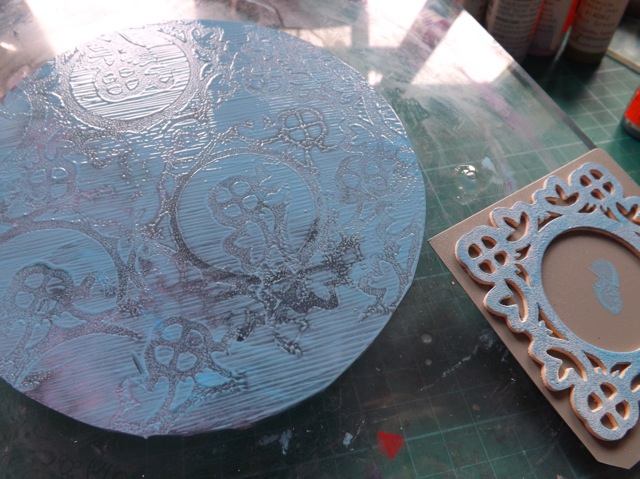
I was quite excited when I saw there was another “gelatine” plate on the market!  It was a bit cheaper than the Gelli plate, and thinner.  It was the thinner that really got me excited.  Cause I was hankering after a round plate, and then after the smaller sized ones, and I immediately thought I can cut that! And indeed I could.  And did.

stampendousCP

I started by cutting some paper shapes to check the size, although in the end I got more than my first plan.  I got:

  • one  6  x  4
  • one  5 1/4-ish round
  • one  4  x  4
  • one  2 3/4  x  3 3/4

And looking at the scraps I had left I thought What the heck? and cut a large heart, a 1 inch circle and a slightly bigger than 1 1/2 inch circle using one of the Sizzix thick dies.  Yep. You heard me.  I die cut my Creative Palette.  And this was all before I used it for the first time.  Evidence, you ask?

3stampendousCP

This was all before I used it, cause, you see, I expected that it would work pretty much EXACTLY like the Gelli Plate.  Ha   HA   HA. The joke was on me.

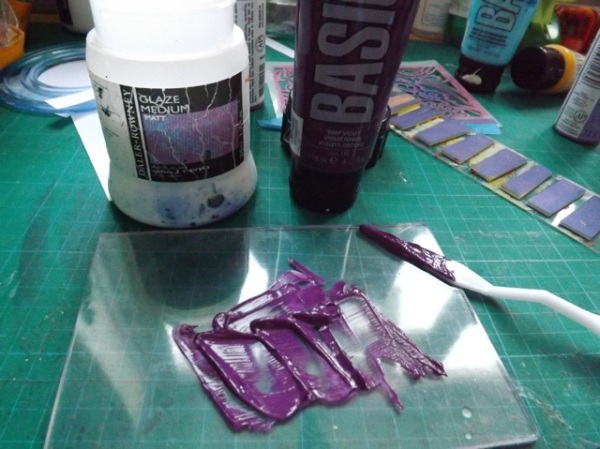
Excited to have a play, I pulled a print.  I was using the Basics paint, so slightly better quality acrylic.

4astampendousCP

What? That was a simple print – bubble wrap that had a bit of purple on it, pressed to the plate.  OK so I tried the cheap craft paint, lighter body, not so quick to dry.  Better.

4bstampendousCP

OK so then I tried the craft paint and tried to pull a print thru a stencil.  WTF?!

5stampendousCP

This was NOT going as I expected.  I hopped over to You Tube to see what sort of demo videos I would find.  Found this one. What was obvious was that the techniques shown did NOT include many of the ones I love with the Gelli Plate.  So I carried on experimenting.  I tried the small shapes.  Added the paint, laid on the stencil, brayered off the paint (tried to)

6stampendousCP

Then printed with them.

7stampendousCP

Not very crisp, but possibly with some work it could be OK.

I grabbed one of my home made foam stamps and tried lifting off the paint with that – again, I’ve done this 1000s of time on the Gelli, but….

8stampendousCP

DOH!  To be fair it is hot here, but the paint dried so quickly and the plate gripped the paper so strong it tore it.

The video shows slow-drying medium, which I don’t have, but I certainly have used Glaze medium to increase the open time of paint so I gave THAT a try:

9stampendousCP

A MASSIVE DOH!

10stampendousCP

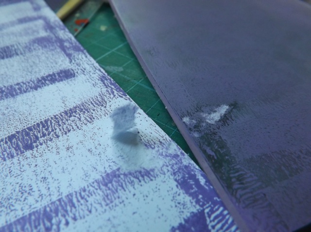
I had plenty of dried paint on the various plates so I grabbed my packing tape and …

packingtapeno

DOUBLE DOH!  I know that is hard to see but at the top left you can just about see the yellow smudge and you can clearly see the plate is still loaded with paint.

I had a look at the packaging and saw mention made that spritzing the paint with water would allow you to pull further prints.  I first tried the stencil again, this time doing the normal process – paint on plate, stencil over, thinner (printer) paper over to pull thru but gave it a bit of welly, as they say:

13stampendousCP

Then I rubbed really quite hard with my thumbnail, really pressing into the paper –  I almost embossed it, I was rubbing so hard!

11stampendousCP

And that gave me an almost acceptable print:

12stampendousCP

I then tried the water spritz, which improved things a lot – first pulling thru the stencil and then printing with the stencil removed:

3stampendouswater

4stampendouswater

Just for comparison, I grabbed my 6 x 6 Gelli plate and tried the same, with Basics paint as well – just to be fair, cause if it was the heat of the day that was causing the problem that would matter:  Nope.  Gelli plate pulled thru the stencil just fine

gellicompare

and the second pull was just as dark

2gellicompare

What have I concluded?  If you want a Gelli Plate, get a GELLI PLATE.  While I have no doubt with a little practice, and more experimentation I can make these plates work in some way, I think the unpredictability of them will make for a frustrating printing session.  I would perhaps pull the paper away more with dread than anticipation! Perhaps if I scale back my expectations I might be OK with it, but is that really what you want to do when being arty?  Expect less so you aren’t disappointed?

Why does this plate perform this way?  It FEELS different.  The surface is …firmer, I guess, and it doesn’t have nearly the give in it the Gelli plate does.  The thinness of it might be nice on one hand, but it works against it on another – when you press the paper to it you don’t feel that sense of yielding like you do with the Gelli.  I don’t think the recipe can be the same either, and I think that has to be the core reason why this was such a disappointment – it just doesn’t react with the paint the same way.   I had a lot of ideas for experimentation but the reality of it is that (as is so often the case) I, as a consumer, was lured initially by the slightly lower cost (I’ve seen them as low as about £14 ) initially, but seriously seduced by the thought I could chop it up.  In all other aspects I EXPECTED it to work just like my Gelli Plate did – and it didn’t.

So, to add to the I make the mistakes so you don’t have to …. list, I’ve tried the Creative Palette so you don’t have to. But if you have, and had a better experience with yours, please, do share.


2 Comments

Summer printables for Project Life

It’s been hot here and finally feels like proper summer.  That made me think summery thoughts so I made these quick printables.

summercards


The turquoise looks quite intense on the screen, but it could be my monitor colour sync settings – just for comparison I printed them and on my printer they come out like this:

summerprinted

Your printer and monitor are likely to show different colour values than mine do, but maybe seeing the screen grab beside the printed version you will have a better idea of what to expect when you print them?  Maybe not, but hey, it’s worth a shot!

Just one page and you can download the PDF here.  I did SAVE AS using the Quartz filter, so the file size is reasonable at under 1 mb.  It shouldn’t have any loss of quality but feedback to me if you feel they don’t print well – I suggest Matte Photo Paper and High Quality for the printer settings.

Because people often want to know, the font I used is called Alpaca Solidify and can be found here.