Sorry about the snafu and super late post yesterday! I had created a post, and thought I saved it and scheduled it, but them The Hubster came home from skating and I asked him to do a back-up on my machine (he keeps the back-up disk in the car so if the house burns down the disk is safe) and I guess I messed up the date and time of the post. It might have published but been placed in early November rather than December. Oh well. It’s in the right place now.
So today I am able to share some progress on the cover:
I want to add the word STORAGE under ATC and maybe edge the whole thing with the gold, but it needs a little bit longer to dry.
The big news is…Christmas cards! Going back to a tried and true design, printed the embellished.
Some Happy Christmas and some Merry, depending on which side of the pond they go. I did a post AGES ago on how to make these. Maybe it will be of interest? And there is a set of kraft-background printables as well as the white background here. You can see these (made from the kraft version) are cute too.
I have to get a wriggle on because stuff mailed to the USA is taking a while and I want to make sure they arrive before Xmas. Most will go in packaged with the gifts, but the odd one might go on it’s own.
I have been in an absolute whirlwind of activity for the last 4 days. Now Thanksgiving is over, that Big-C holiday is looming and there is a lot to do to prep for it. The biggest problem is my sewing room. There is a massive, heavy table, that had all of my sewing stuff and my machine on it, that blocks the cabinet where the Christmas tree and all the decorations are. I had to more it all around to access the festive goodies. And believe me, before the turkey was cold and the last bite of pumpkin pie eaten, Darling Daughter was all “So when will we put up the tree?” Sorry to say that simple task created a cascade or shuffling and sorting and rearranging. The Hubster and I toted an entire bookcase of books up a level, I moved two more bookcases into my craft room, moving out one piece of furniture of limited use, then of course had to populate those shelves with things from elsewhere. Then there was a massive effort in the kitchen to better organize and relocate my cookbooks, and make room for the now ex-dvd shelf to become a pantry. We have no idea what food we may have squirreled away from buying multiples of something we use a lot of when we find it on sale, or when we stock up on something during a rare Costco run. This is the only explanation for eight bottles of green pest and four bottles of red! OK, so they are small bottles, and good into 2022, but still….
Boring right? especially with no photos. You will see some on WOYWW day as I photo my desk, but I fear it won’t look startlingly different, even though there is an additional 6foot bookcase that will be on view.
I do have one thing I will share – I have been keeping my ATCs to trade in clear envelopes, but I am finding that unmanageable. I have a stash of baseball card sleeves but what I don’t have, and what is rare as hen’s teeth in the UK, is three (THREE – not two, not four, THREE) ring binders. I managed to find one very ugly one that was falling apart, and I am in the middle of decorating the cover of it so I can use that for my ready-to-trade ATCs, cards and coins both.
I have to stick this cardboard piece to the vinyl lining and am going to see how very strong and thinck double-sided tape works. Unclear at this point what else I will do. but hopefully by tomorrow I will feel ready to take it on.
I have all of my ready-for-trade items inside already. I have been very bad about sharing them on the trade sites I usually use. I might just plan on waiting till after the holidays at this point. Happy mail in the new year will be something to look forward to, and all the mail delays (and potential theft if someone mistakes an ATC for a gift card!) will then be avoided. Wanna see how many I have?
Coins first
Now the horizontal ones:
Nothing that I have not shared, I don’t think, but any photos ill make this post a lot less boring, for sure.
As soon as I sort out the cover, a quick share and then it has to be Christmas cards! Oh dear!
Well, I have been playing around with some designs for RedBubble. I’ve realized it’s the designing, and figuring out how to do what I envision in my head that is the fun part for me. So yeah, my items are a bit all over the place LOL!
Of course I began with my signature design, the one I still love best and the one I began with on Amazon as well:
But then I found some images that I really loved and I wanted to figure out how to use them in interesting ways. Without a doubt, my favourite one is a crazy image of a cat dressed as Brunnhilde! I mean, what’s not to love? And I am very much NOT a cat person, but even I think this one is amazing.
I love that you can make your design available on all manner of things, from Tee shirts to mouse pads to clocks! How funny would it be for a bar-hopping Hen Night party to have the shirts customized with the bride-to-be’s name? I love that I can do that if I want.
So I am not a cowgirl either, but when I saw this old romance comic I just could not resist. Not a cat lover, not a cowgirl, not much of a drinker and yet….
You can see that many of the coffee mugs do not show the design in the right place. RedBubble acknowledges this is an issue. But as you can see, some of my mugs DO show the image in the right place. When you upload a design, you can tick a box to select the display angle. No matter what you pick you get the handle on the right view in the main display. So if you place your design so it is facing out (towards the world) as a right-handed drinker, the mug displays as more or less blank. and if you place the image in the “middle” of the mug, so it is across from the handles, you get the sideways slice view. But most people don’t really want the design placed in that way. I came up with a solution that is (to my mind) better in a few ways. I created a template that looks like this:
right click to download the .png!
Now, this works perfectly in my program, but obviously you may need to fiddle with it in YOUR program to get the sizing right. But the idea is to add your image twice, each centred on a red line. Like so:
Delete the placement .png and save the image. Upload it to RedBubble and you have solved two problems: the mug display shows the image, AND you can declare that with two images the image will face outward to the world (as well as inward to the drinker) whether they are a left-handed or right-handed mug holder. Result! I haven’t quite worked out how best to deal with the Life Is so Daily all over design, so for now that is placed across from the handle. Can’t solve ALLLL the problems in a day now can I?
My shop is very, very small, with only this handful of designs, so I figure I have a few days to get all of them sorted and I probably won’t get any traffic anyway so it isn’t a problem to systematically work my way thru them.
At the moment I have one more design that makes me laugh – I have used the phrase It is far too peopley out a few times on ATCs or art journal pages or whatever, and when I saw this Edward Lear image of course that is where my mind went! I also loved Lear’s name of the plant,and it would be rude to leave this one out so I’ll add it:
Sorry that got super long but I was so keen to share. My brain is in over-drive and I have a lot of ideas but little time. Isn’t that always the way……?
Scheduled, as surely I am stuffed to the gills with festive foods.
If you recall I mentioned earlier in the week that I had gotten some faux postage stamp dies. They are of various sizes and sadly not quite right for any of the previous Workdesklandia stamps I made previously.
Some were close but some of the dies were joined in such a way that you can’t really cut them apart.
I took the time to go thru a few steps, scanning those frames and making .pngs of them so I could reduce the opacity and see thru them.
That made placing the stamps a lot easier, and allowed me to create a specifically placed grouping for the grouped dies!
Then I just laid them out as a full sheet – probably less than appealing for any non-WOYWW participant but you can download them here if you want.
I had to create a new stamp because one of the trios (which I could cut apart) was a very different size to the other two.
I create the Wen des D’ay Islands by grabbing an .svg of the Hawaiian Islands and breaking the group apart then arranging them in a loose W shape – all playing into the WOYWW theme.
In future I will probably leave the stamp backgrounds a plain white and any colourful background to the overall .pdf will be just surrounding that. But the whole thing was really a bit of fun, and great for WOYWW related Happy Mail, so expect to see them mentioned again on the next WOYWW.
The issue remains, however, that there are dozens of stamp dies, all of different sizes, and there is no way to create something to fit them all. But at least these fit mine, and I’m happy with that.
Happy WOYWW to everyone hopping over to my desk this week. You are most welcome. My desk, in the last 24 hours, has been in a state of flux. It went from pretty horrific to not awful to WOYWW ready!
I was playing with my faux postage, if you recall, and there will be more on that Friday. The semi-clean version was after the mostly tidy tidy-up but then I had to spread out again to compose my ATC trade bags of goodies. Once I had done that my desk really was neat.
I did get two super cute ATCs in a trade that I will share, cause I do love them so.
Aren’t they fab? They are sharing the second-desk space at the moment with the If You HAD To…. cards and the choice is clear this week.
The Big Orange Cheet-o Man is my least favourite person by a mile and there is no way in hell, no matter how much time elapsed, that I could ever call him “friend” so I guess I’ll be yelling Lights! Camera! Action! a LOT. Oh well.
And finally, when I got my postage stamp dies from Wish, I also got a duplicate of something I ordered in the past. Anyone want to trade one of their own duplicates for it? If not, off it goes to the charity shop…
I’ve not used the original one yet, as I kinda fell off the cardmaking train, and now even if I did make some these aren’t exactly seasonal. They do look quite cute, once you cut them all apart, as they should layer nicely.
The Hubster and Darling Daughter have their booster jabs today, then Thanksgiving tomorrow, so you won’t hear from me again till Friday. I will be overindulging in a feast. Yummy.
Hope you all have a super happy WOYWW day and I hope you will forgive me for adding the link to my DDs disability Synchro team competition. They won gold, with a score that passed even some “normal ability” teams. I can’t embed the video but this is the link where you can watch it. They skate to This Is Me and (fair warning) expect to cry.
So I finished my page. I always begin art journaling again after a long time away in my small Roben-Marie journal. The pages are diddy and I can get that sense of accomplishment without a lot of time and stress. It kinda sets me up for success, iykwim. Plus the base pages are not blank, and some of them are really pretty even as is:
I’ll digress a bit more – some of the other stuff I got with those stamps, was meant to go hand in glove with the faux postage. I think it was Zsuzsa who spoke about all the various postage dies and hiow they never seem to fit the things she needs them for. I get that – look at this array!
Some of them are really close to the size I would need for my own faux postage.
Of course, the best thing is I designed that postage, and I can size them as I please. And I will but, for the purposes of this page I just used one I had cut for a sample. Remember, this page is from stuff hanging about on my desk:
I wanted to sort of commemorate WOYWW so the stamps were a must, but I also used bits from the edging, and the little eye-strips were from my pile of ATC trade-bag fodder pile. Sorry the photo isn’t so great. Like I mentioned before, the time I have at my desk to take photos so often ends up being when the unflattering shadows lay across my desk. Let me see – I moved the journal to the desk by the window and at the time I am writing this the light is good there:
Is it better? I’m not sure. Maybe slightly but if I took the time to adjust the photo digitally it might have been about the same. Oh well.
So what now? More art journal stuff? More ATCs? More KDP?
I think I mentioned I was feeling the pull of my art journal recently and over the weekend I decided to make a page. When I am in this place, a long time away and feeling out of practice, I do a warm up, using stuff hanging about on my desks. This time it was no different. Although, this is where the “cautionary tale” part comes in.
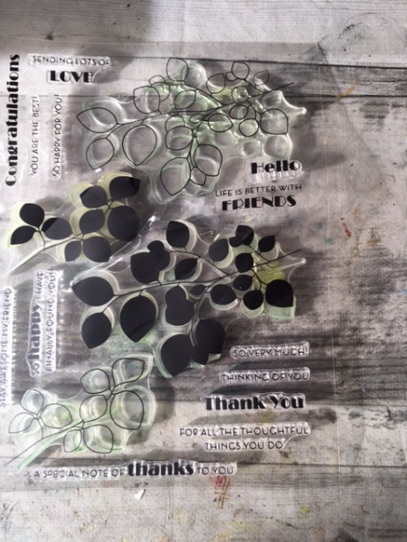
A wile ago I had bought some stuff from WISH. I got a set of stamps that I thought were cute. Some layered stamps with leaves on them and some useful card sentiments.
The while thing arrived quite crumpled but the stamps stamp just fine. So imagine my surprise to see what looked like a set of dies that would match! Except…they don’t.
This is, I’m sure, one of those cases of a knock-off. Sadly I am not super clued-in on the various brands, and I didn’t realize when I bought the stamps they were actually Alte New (Alte & New? I don’t even know that!) and should have been bought as a pair. So they aren’t horrible, I bet a lot of the miss-alignment is me having little experience with layered stamps or stamp+die sets. I wonder if the real Alte New version has registration marks or something to help you line stuff up correctly. Cause if they don’t I sure wouldn’t bother buying the stamps that fit!
So there you go. The page didn’t make a lot of progress as I fought to try to get the stamped image and the die to play nicely together. The germ of an idea was using my faux postage (and more on that another day) but I only got here:
before I had to move on to other household tasks, set up for the week to come. But before I go, one final stamp sadness. I have a stamp, one from my old job, where I was the classified documents librarian at a government contractor, that I used often in my art over the years. Sadly, it gave up the ghost, the rubber totally disintegrated and rubbed fell apart:
I think you can see how deteriorated the rubber is from the attempted stamping. Shame. It would have fit perfectly on the page I had in mind.
As I mentioned, I wanted to alter the message of the original postcards from movie posters to offer a more positive spin on them. Some of them just got right up my nose, as we say here in the UK.
As you will have seen the other day, I printed quite a lot of bits of text, played around with so many different versionsof these, and in the end, I still have a LOT of bits left over!
But the cards all turned our pretty well IMHO. I am not sure I want to trade them LOL!
This one had to change as I didn’t really want to focus on the gun. I think I covered it pretty well and like the final version a lot better:
I know they aren’t “arty” in the same way most of my ATCs are, but I do like to mix things up a bit every now and again!
I am really feeling the pull of my art journal lately. I might step over to that one day soon. And I have two or three more KDP notebooks and even a couple of kids books I am finalizing (with help from my sister, and my two nieces, one a writer, one a teacher) so they may seen the light of day one day soon.
I just have too much I want to accomplish and too many drains on my time….
While I have finished my ATCs and they are ready to share, I got the link to the SPICE Synchro performance at Skate London and what can a proud (and tearful) Mom do but share? The words of the song have a particular resonance for a disability skating group and they did the most amazing job. I can’t embed the video but this is the link where you can watch it.
If anyone would have told me my darling daughter would be able to skate on a synchronized skating team way back on her first few times on the ice, when it took not one but TWO strong men to hold her upright, skating on those kids skates that strap over regular shoes and have a double row of blades, I never would have believed it. And now there she is.
My heart is bursting with pride and full of joy.
Your regularly scheduled crafting posts will resume tomorrow. Thanks for indulging me.
I had a lot of fun flipping thru the postcard booklets. I pulled out a few images to scan and cut up and as I was doing so I realized a few things:
they used girl rather than woman more often than not
the women were depicted as sexy, but the words implied this was a bad thing
they were often depicted (or stated) to be inferior to men
it was implied that without a man, they were unhappy, or somehow diminished.
I must digress to mention the famous story – not sure where I heard it, probably in an English class sometime – where a class is asked to punctuate a sentence:
Woman without her man is nothing
They could use any correct punctuation they liked. 99% of the class did so as:
Woman, without her man, is nothing.
One bright spark went another way and wrote:
Woman! Without her, man is nothing.
So my original idea had been to use the text from the cards except they were all so unflattering it didn’t feel like the message I wanted to send. Lost, lonely and vicious? What happens to women without Men? Man Crazy?
So I decided to sort out how to put a positive spin on them, somehow. I ended up printing out a LOT of bits of the text in an effort to try to make some affirmative text for each card.
Yikes. Here is a look at some of the in-process cards:
Some of those changed, as you can maybe see below. It took me all day to get to this point and the cards still need refining.
Now there is other stuff I need to do so I’ll have to set these aside and finish in the morning. I hate it when my crafty sessions get broken up but it is happening more and more. I don’t expect it’ll get better till after the holidays so I might as well accept it.