I’ll tell you what I am sick of…internet issues in rural Hampshire. Meh. I’ve spent entirely too much time with my ISP trying to work out the problems with my internet, to include crawling around under my desk and swapping out a test router for the one I have. All well and good, except the cables they supply are ridiculously short so I am left with equipment in unworkable places, in order to make the connections.
I can’t even properly sit at my desk! As this is meant to be a temporary situation I am not keen to completely reorganize to accommodate so I’ve just tried working around it. That will help to explain why I have been MIA over the last week. BT is coming on Monday, and with luck that will actually sort things out. But hearing about my internet woes isn’t why you are here. This is:
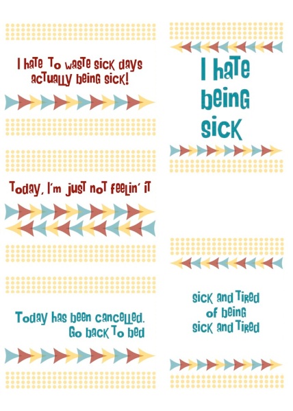
My poor patient commenter, who asked for SICK DAY printables, has probably given up on me. But here they are. Click to Download the PDF.
A couple of things to note: My printer needs pink and yellow ink. When I print these, the “blue” more BLUE and not is as I designed it, a bit turquoise. If you print them and what you get is not turquoise, I’d like to know that. I’ll test it myself when I replace the ink, but I’m always interested in how my stuff prints on other printers. Next, I was aiming for things that could be used for both kids, sick, home from school, as well as adults taking a day off work (sick or not!) I’m not trying to address, specifically, depression or a more serious or chronic illness, but these can be used for those situations, if you think they fit. As with the BAD DAY printables, I hope you never need these, but the reality is you probably will
😦


Pingback: Freebie: Sick Day Sentiments – Stamping
18/01/2015 at 1:43 am
Hi! I just printed these (thanks for another adorable freebie by the way!) and the blue on mine is definitely turquoise! To me the blue words look a little darker than the blue arrows but the arrows look turquoise too. On my computer screen when I look at the one you posted it actually looks like 3 different blues with “I hate being sick” looking the darkest, the other two blue quotes being a bit lighter and the arrows being a bit lighter still; but printed it only looks like 2 different shades. Anyway… thanks again!! 🙂
LikeLike
18/01/2015 at 7:36 am
Thanks for that! The arrows have the opacity knocked back so they look lighter but they are the same color. The quote that is biggest, I hate being sick, is the same color too, but bigger makes it seem darker. 🙂
Must order more inks!
Cheers
MA
LikeLike