
I am always surprised when an old post of mine all of a sudden keeps getting views and pinned, and I get questions that I can’t answer cause it’s been SO LONG since I did the original thing. This post is getting hit hugely. I did that back in 2012 so I hope I can be forgiven for being a little fuzzy on the details LOL!
I decided I should go back and do the technique again and try a few other variations. Luckily (?) the power was out AGAIN today so I had plenty of time to play.
So let’s begin.
I thought I would try
- the black acrylic paint
- Archival ink
- Memento ink
- Pigment ink
The process is pretty much the same to begin with, then there are some options.
1. ALL – Smudge on your Distress ink to create areas of colour

2. ALL – let it dry COMPLETELY or blast it with the heat gun. Distress ink stays wet for a bit and will grab the embossing powder if you rush this step.
3. ALL – stamp with Versamark or other clear embossing ink then sprinkle on clear (ideally DETAIL) embossing powder, depending on your stamp.
4. ALL – Heat emboss and let cool

5. ACRYLIC PAINT – using something smooth, like Cut ‘N Dry foam (can’t find mine, used a make-up sponge, and that is NOT as smooth) spread the black paint over the entire area. You can let it dry and cover it again if any inked areas peep thru.

6. ACRYLIC PAINT – with a slightly dried out baby wipe, daub off the paint from the embossed areas, revealing the trapped Distress ink under the embossing. DO NOT use a super wet wipe, and DO NOT rub hard. You will take off too much of the paint.

This is pretty much exactly as described in the original post.
5A. ARCHIVAL INK – smudge Archival Ink over the entire area. You will find this easier (I suspect) if your ink pad is new and juicy. Mine is older so I struggled to get a deep,rich, black cover.
6A. ARCHIVAL INK – burnish off the Archival ink from the embossing. Harder than it sounds. I tried using the clean area of the make-up sponge, It worked OK but not great.
Then I tried a damp baby wipe. Better, but still the Distress Ink below the embossing wasn’t bright like with the paint.

Then I tried a wetter wipe and it took away some of the ink on the background as well. Here you can see the difference between the Archival Ink and the Paint.

5M. MEMENTO INK – again, smudge the Memento ink all over the surface. This was a background stamp so the areas to grab the ink were smaller.
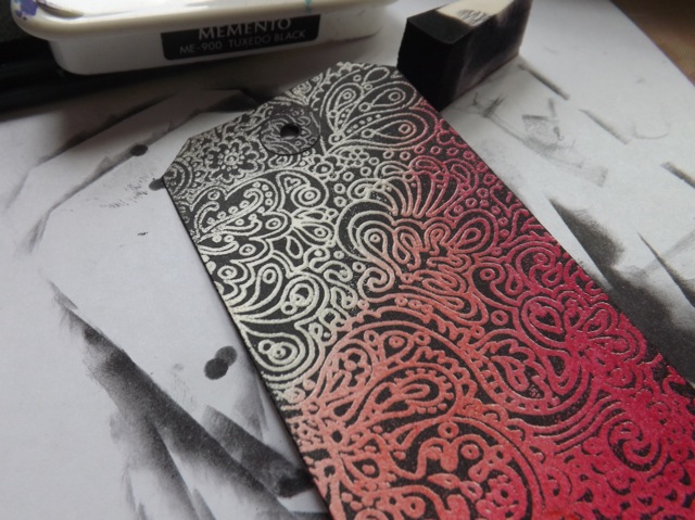
6M. MEMENTO – I almost didn’t need to bother burnishing off the ink. Just the rubbing of the ink over the embossed areas with the make-up sponge removed any ink from the embossing. The Memento is grabbed by the background card only. So perhaps the EASIEST, but check out the next shot – even with the different sorts of stamps, I hope you can see the Memento isn’t super dark and rich.

again, it COULD be my slightly tired ink pad. I would expect Versafine to work in a similar way.
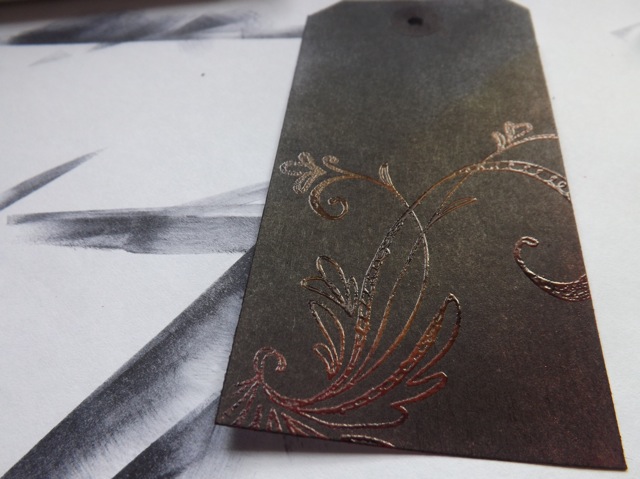
5P. PIGMENT INK – this worked a treat. Smudged on the ink with a Colorbox teardrop, direct to paper.

Nice and dark, good cover. Some hint of the Distress Ink showing thru but a 2nd coat maybe would help.
6P. PIGMENT INK – I just knew that a wet wipe was the wrong way to go with this so I didn’t even try – I used a finger wrapped in dry paper towel to rub off the pigment ink. I did this while it was still slightly damp. If it were super dry (and pigment ink takes a while to dry!) a very very slightly damp wipe might be OK.

Really, that doesn’t do it justice. The pigment ink is deep and dark, and the trapped Distress Ink is brighter than it looks. Still not as bright as the PAINT version, but better than the Archival and almost as good as the Memento.
7. ARCHIVAL and PIGMENT ink – sandwich the piece between two sheets of paper – I used an old graph paper tablet – and iron off the embossing powder. It will melt and get sucked into the paper

and when you remove the paper…

WOW. Totally POPs. Trade off is that the raised embossing from the clear powder is gone, so it looks more like plain old stamping, although you do get a bit of a halo effect on the edges, which is nice. But colour-wise it’s pretty close to the brightness and intensity of the paint version, even if the black isn’t as nice for the ARCHIVAL version.
Not sure how to rank them, frankly. The best technique is the one you have all the stuff for already LOL! But in terms of cost, I suspect the PAINT is the cheapest (paint is dirt-cheap compared to an ink pad.)
In terms of fewest steps to get the best colour. I would say PAINT is the winner – with Memento closely behind if your ink pad is new and dark.
I think Pigment ink is closer to OK than not, stopping after rubbing off the ink, but better than Archival by a mile.
Then with an extra step and a flatter result, Pigment Ink and Archival are both good in terms of COLOUR when you iron off the embossing, but Pigment ink gives a better BLACK coverage.

As ever, YMMV. I really do think there are a lot of variables – how dark and juicy your ink pad is, how light, or heavy your hand when doing the wipe-off, how damp/wet your wipe is…. But overall I had forgotten how pretty this can look.
I’ll make a PDF of the post, although it’s the quick-and-dirty Readability version, so it requires me to post it first and then do the process, and come back to add the link. If THIS BIT is hot (clickable) then it’s there and you can download it. If not come back and it will be in bit.
And luckily, just before the power went out, I had printed a little spiky guy that I edited to include a bit of art. DS is a fan of Nujabes (Japanese hip-hop artist, now sadly deceased) so I made him this little desk-top pal. Just for fun.

I’ve finally worked out the best order to stick the bits to ensure the ears are nicely curved. I haven’t folded the feet yet and may not, in case DS prefers the feet flat so you can see the sneakers….

Pingback: Another ICAD Monday trio! | scrappystickyinkymess
03/02/2021 at 10:41 am
OMGoodness, such a lot to take in, coming back later to have another look!
((Lyn))
LikeLike
Pingback: WOYWW 609 – a new project | scrappystickyinkymess
05/01/2016 at 5:12 am
What a fun technique!!! Thank you for updating your steps and sharing all the details! Can’t wait to try it.
LikeLike
22/05/2014 at 7:12 pm
That really is a brilliant technique Mary Anne, thanks for all the tips!
LikeLike
Pingback: Thursday Links to Tangles, Tutorials and Giveaways #zentangle #Giveaways #ArtJournal | lifeimitatesdoodles
20/05/2014 at 8:57 pm
what did you hook the arms onto to the Spiky with?
Thanks
LikeLike
21/05/2014 at 6:56 am
I set him up, held the top of the arm to him, positioning it so the folded up hand sat on the table. then poked thru both layers and added a very small brad. I think you can just about see it in the photo. You do need to add the arms BEFORE you start sticking the top of the head and the ears. Worked a treat. Also, the link you sent? That one is coloured – the other one I sent (same site) is white – I’m wondering if you got it? I would think the clear of ink one would be preferable to anything with colour 🙂
MA
LikeLike
21/05/2014 at 7:38 pm
okay, I saved both of them. I couldn’t see the other very well when it printed out, which is why I thought the other one would work better. Thanks
LikeLike
20/05/2014 at 5:55 pm
Anther fun thing to add to my to-do craft list! finally got a heat gun so now I can try embossing! I’m quite excited ;P Thanks for sharing!
LikeLike
20/05/2014 at 5:45 pm
Can’t wait to try. Thank you. Love the little critters. Tennis are too cute.
LikeLike
20/05/2014 at 5:06 pm
Thanks for doing that, very helpful! Oh and I saw the BIG card post on your ‘related posts’ bar at the bottom, so maybe others did too? 🙂
LikeLike
20/05/2014 at 3:50 pm
You are terrific
LikeLike
20/05/2014 at 2:43 pm
I’m so glad you reposted this. I have done a similar technique, but now I can’t wait to try this one!
LikeLike
20/05/2014 at 12:44 pm
ils sont tous très jolis ses tags…
LikeLike
Pingback: BIG CARDS – Ace of Clubs | scrappystickyinkymess